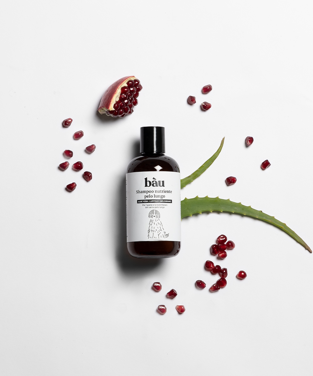
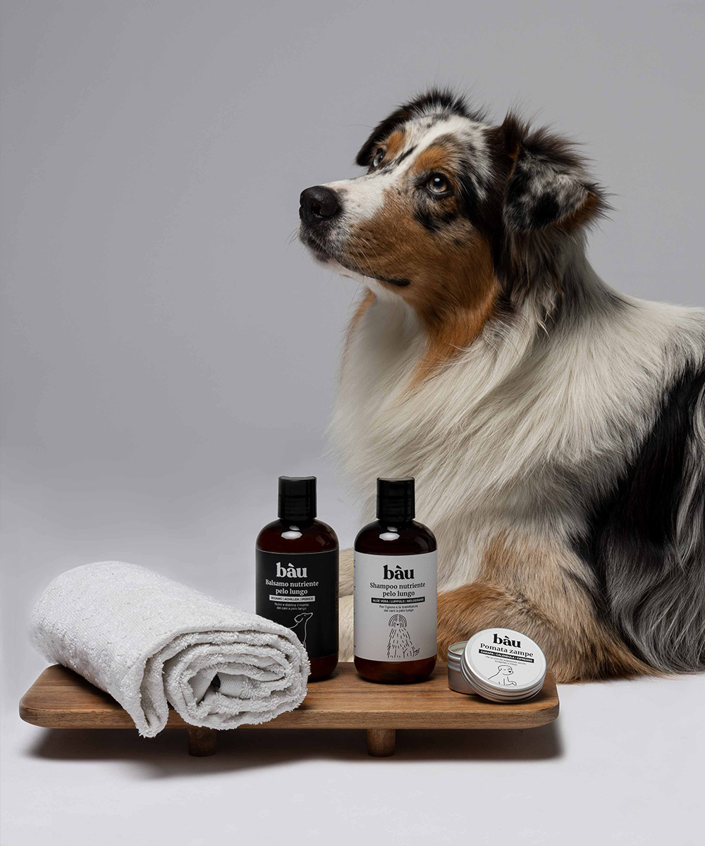
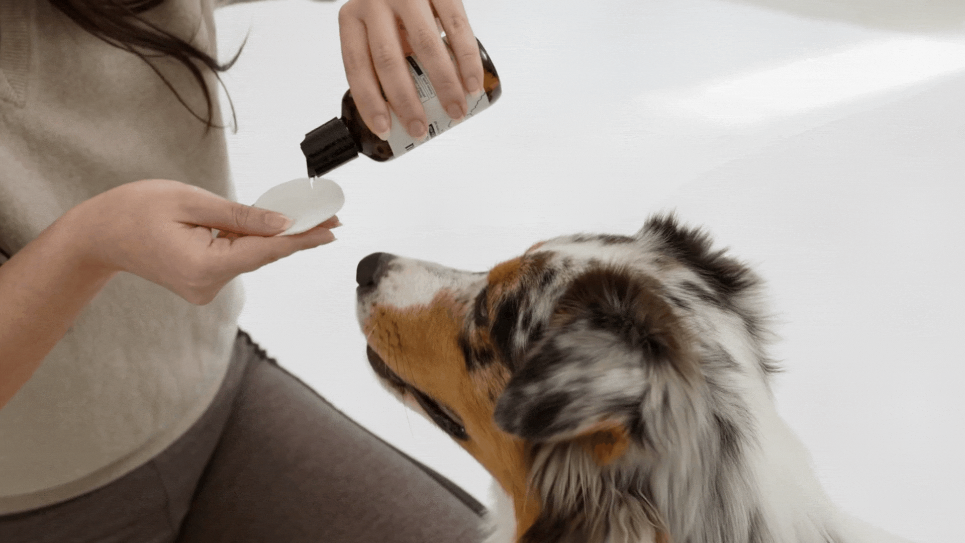
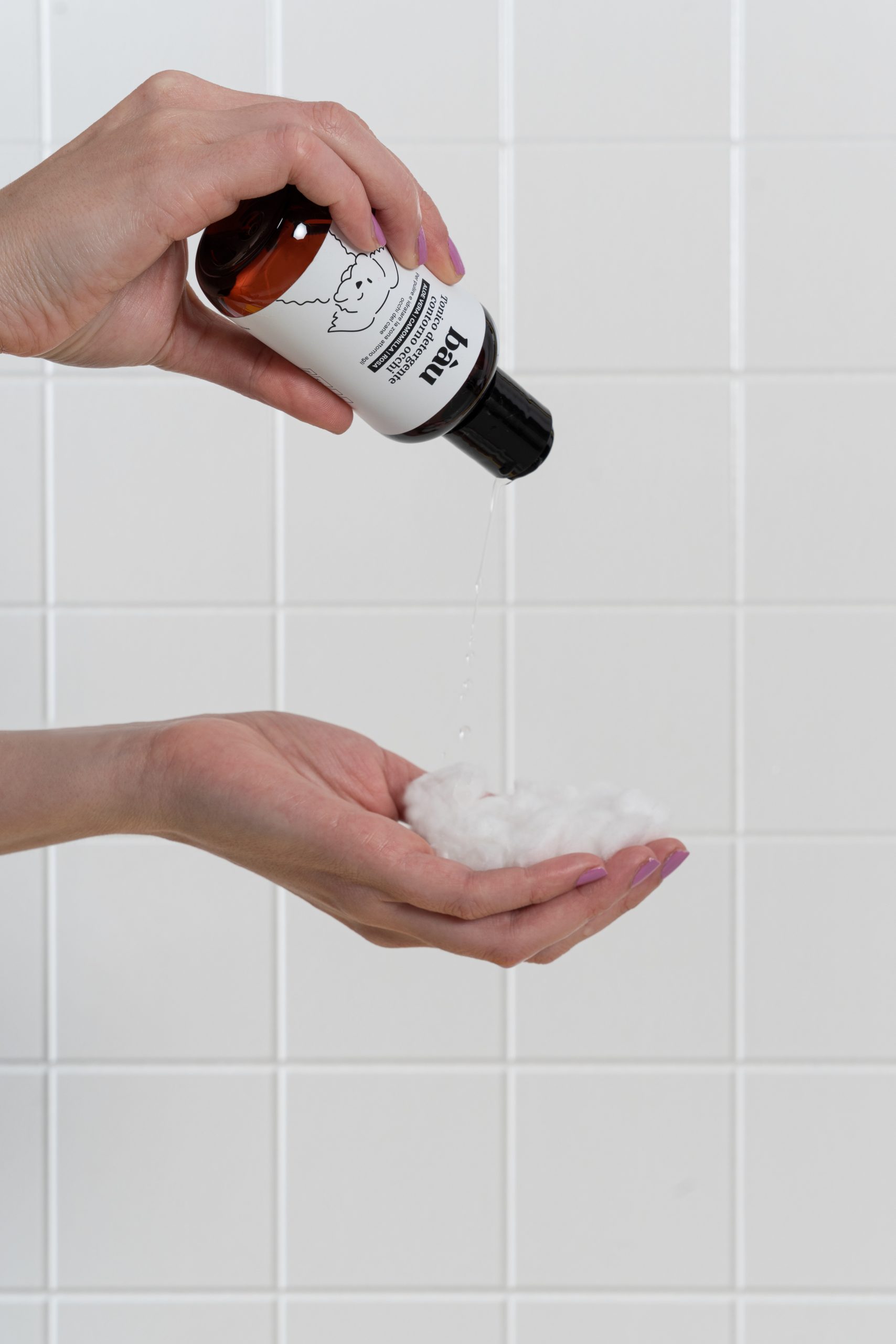
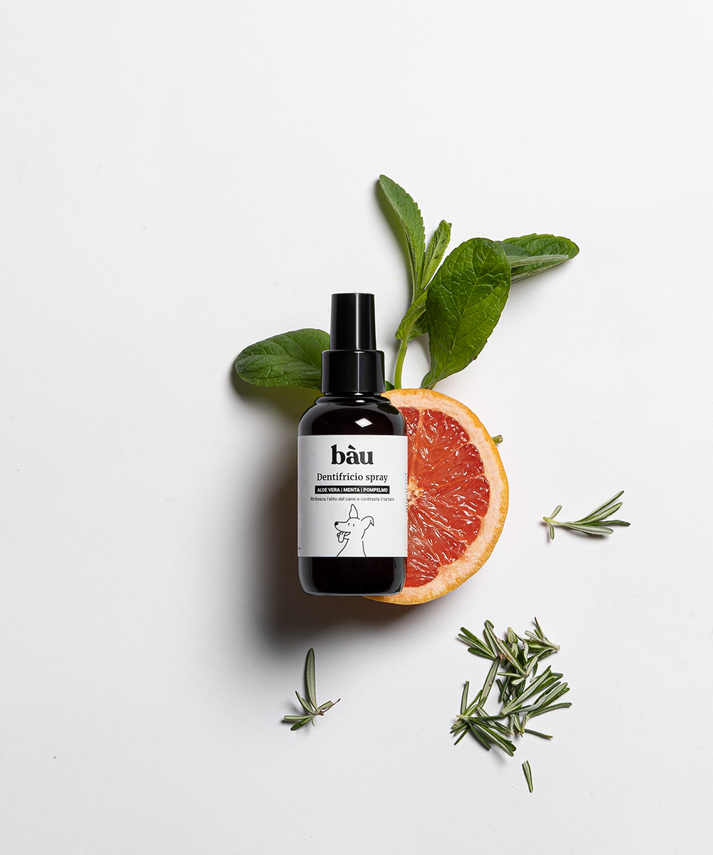
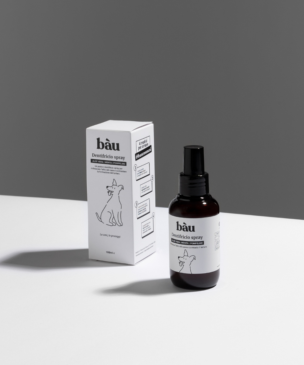
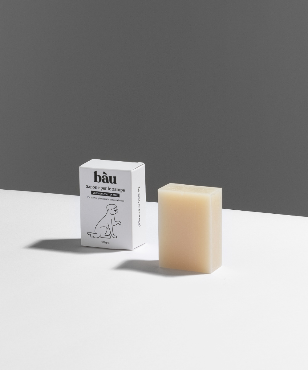
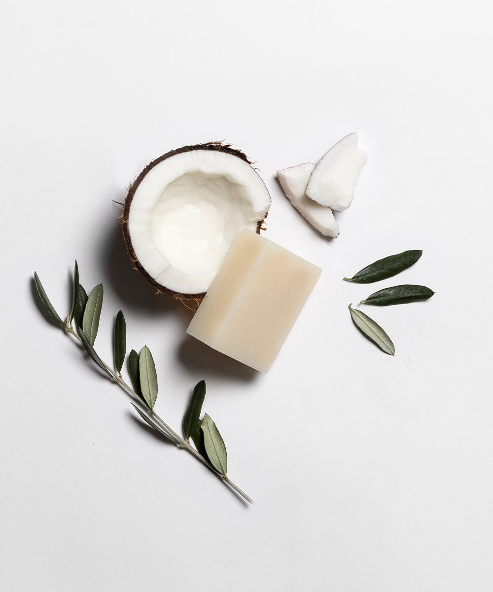
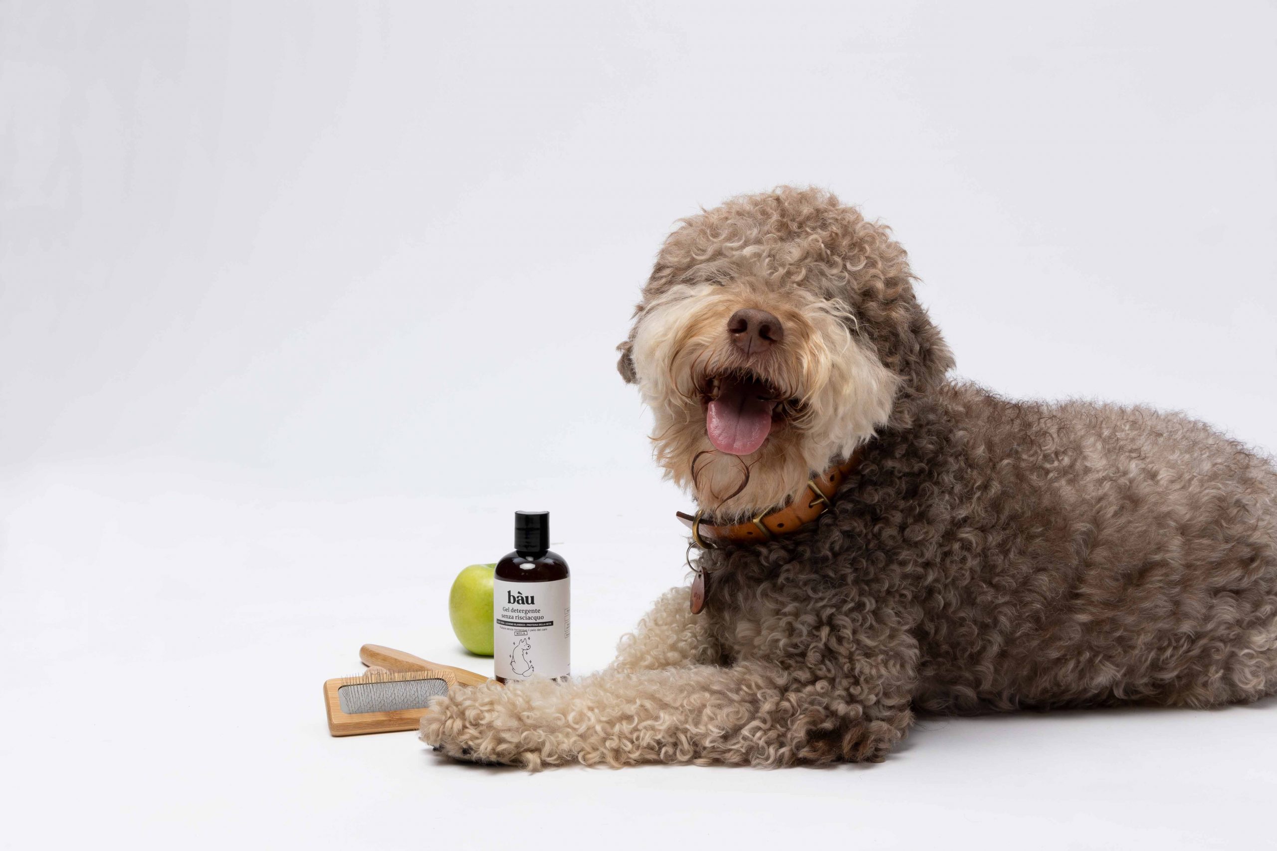
Bau Cosmesi is an italian brand that is committed to offering the highest quality products for the hygiene and care of pets. Our promise is to use only natural ingredients, delicate and safe formulations, to obtain highly effective products that are able to make your four-legged friend always feel at their best. Each product has been specially formulated to meet the specific needs of pets and to support their well-being in a natural way.
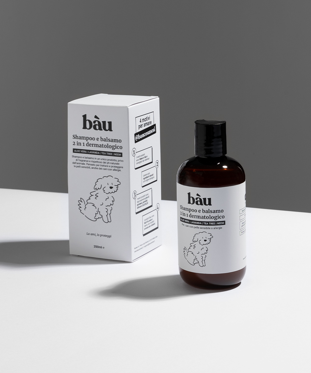
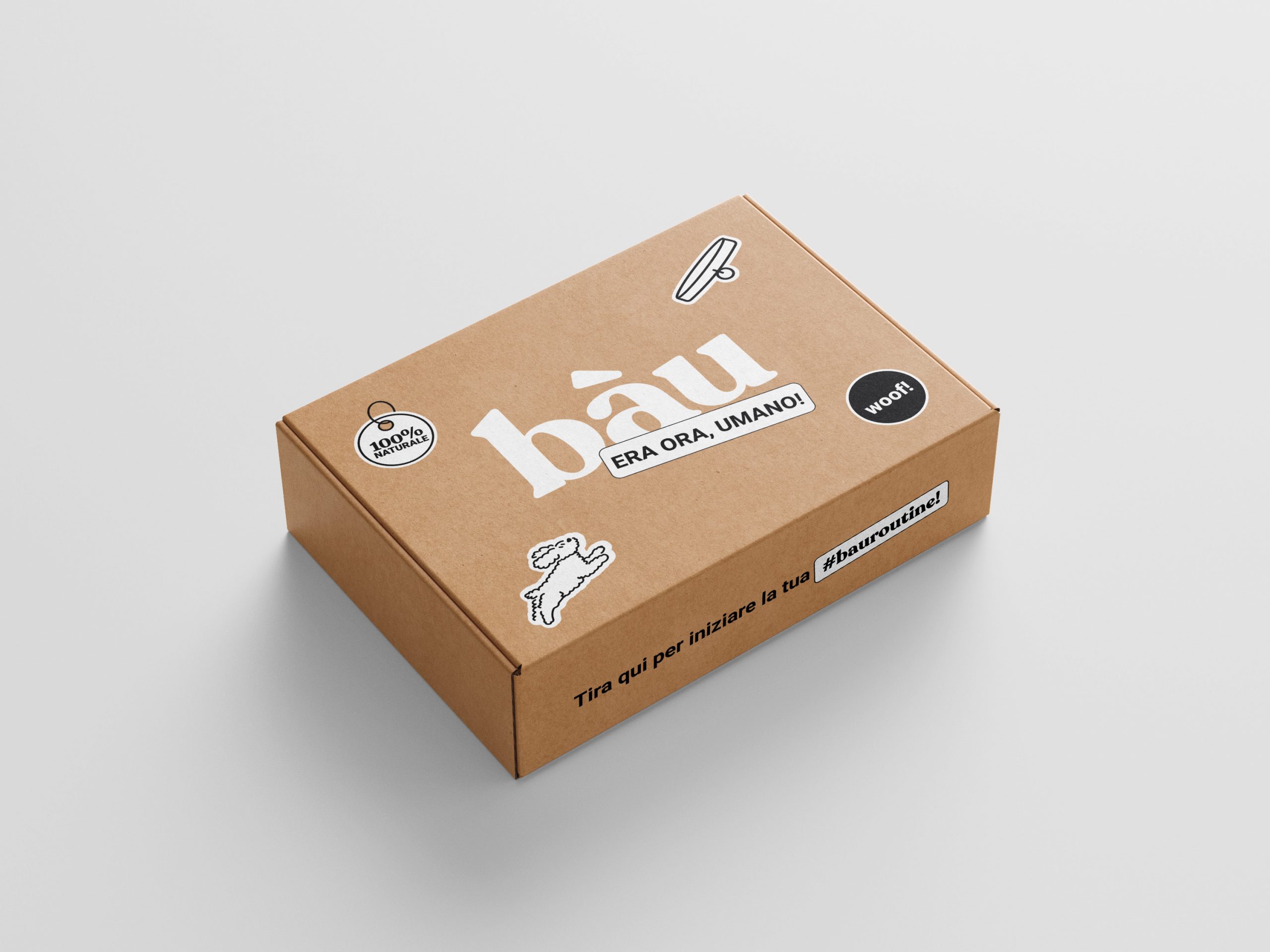
Bau was looking to differentiate itself in the market and convey its values of closeness and quality through a new visual identity. We realized that the market was saturated with ostentatious, outdated, and colorful designs, with little distinction among them. This situation provided us with an opportunity to stand out from our competitors by creating packaging that would capture the consumer’s attention with a more elegant and minimalist design.
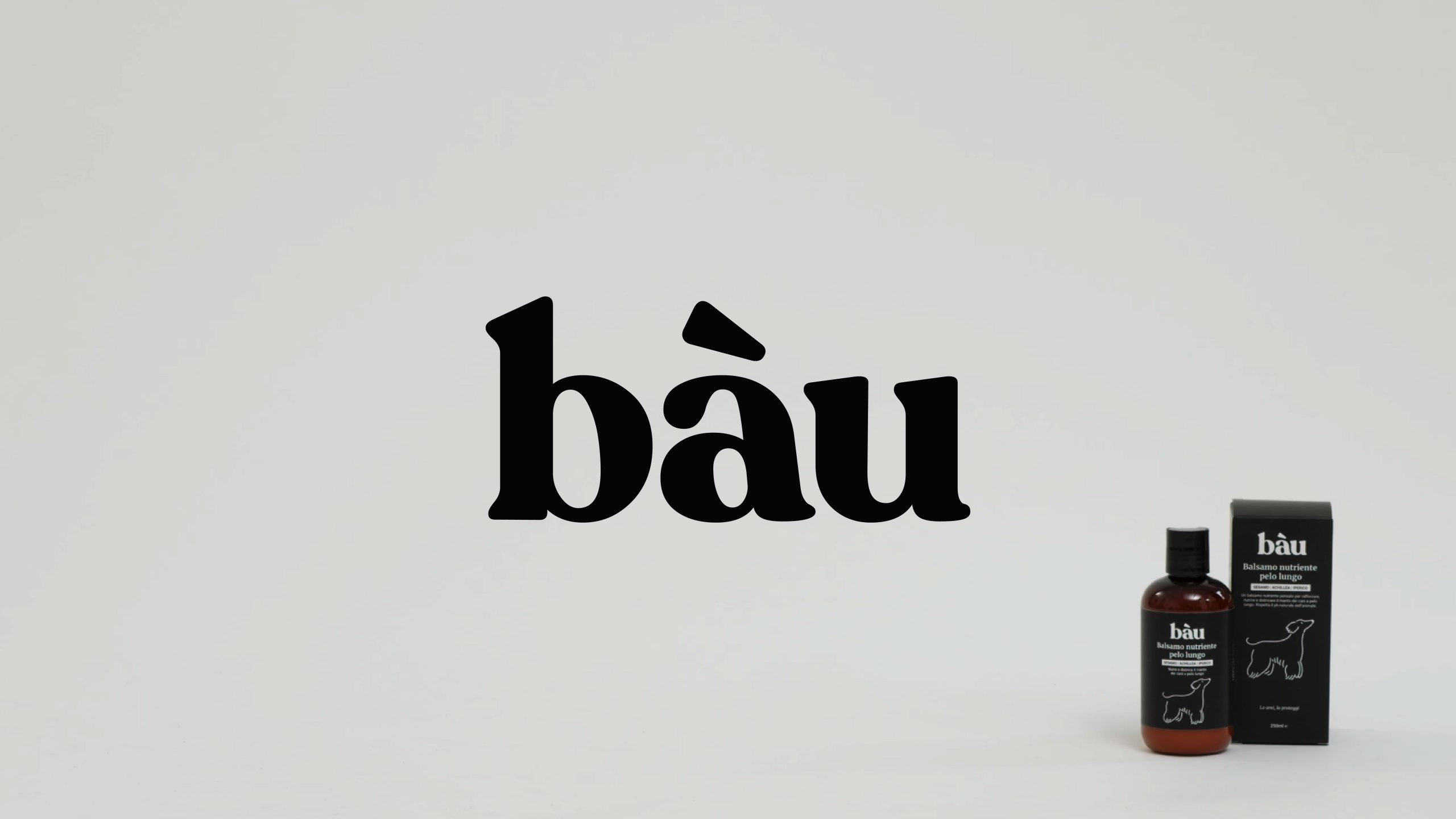
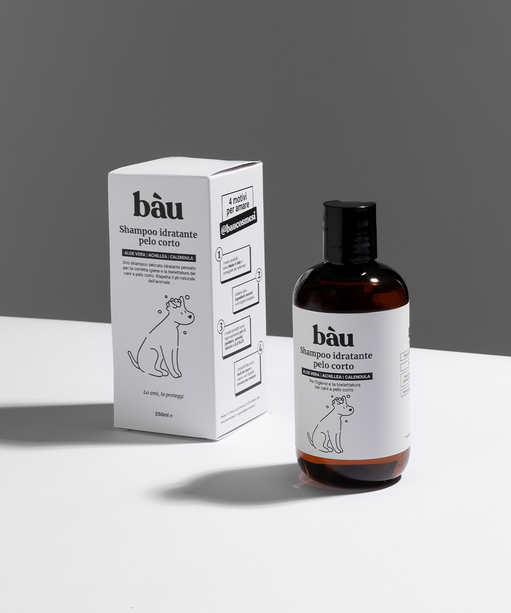
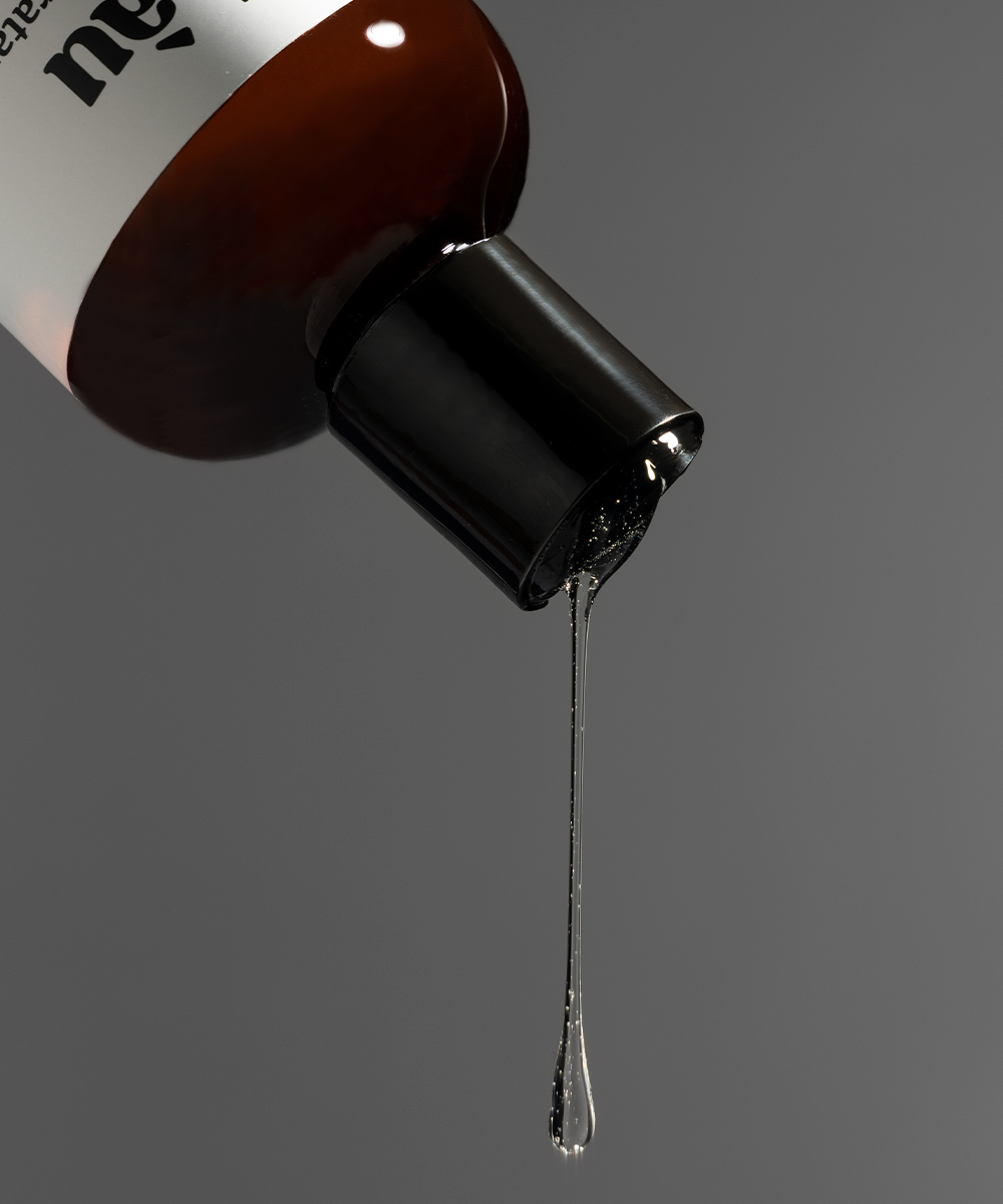
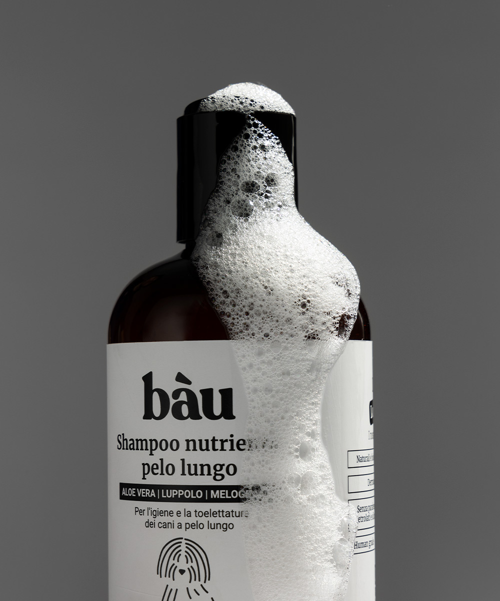
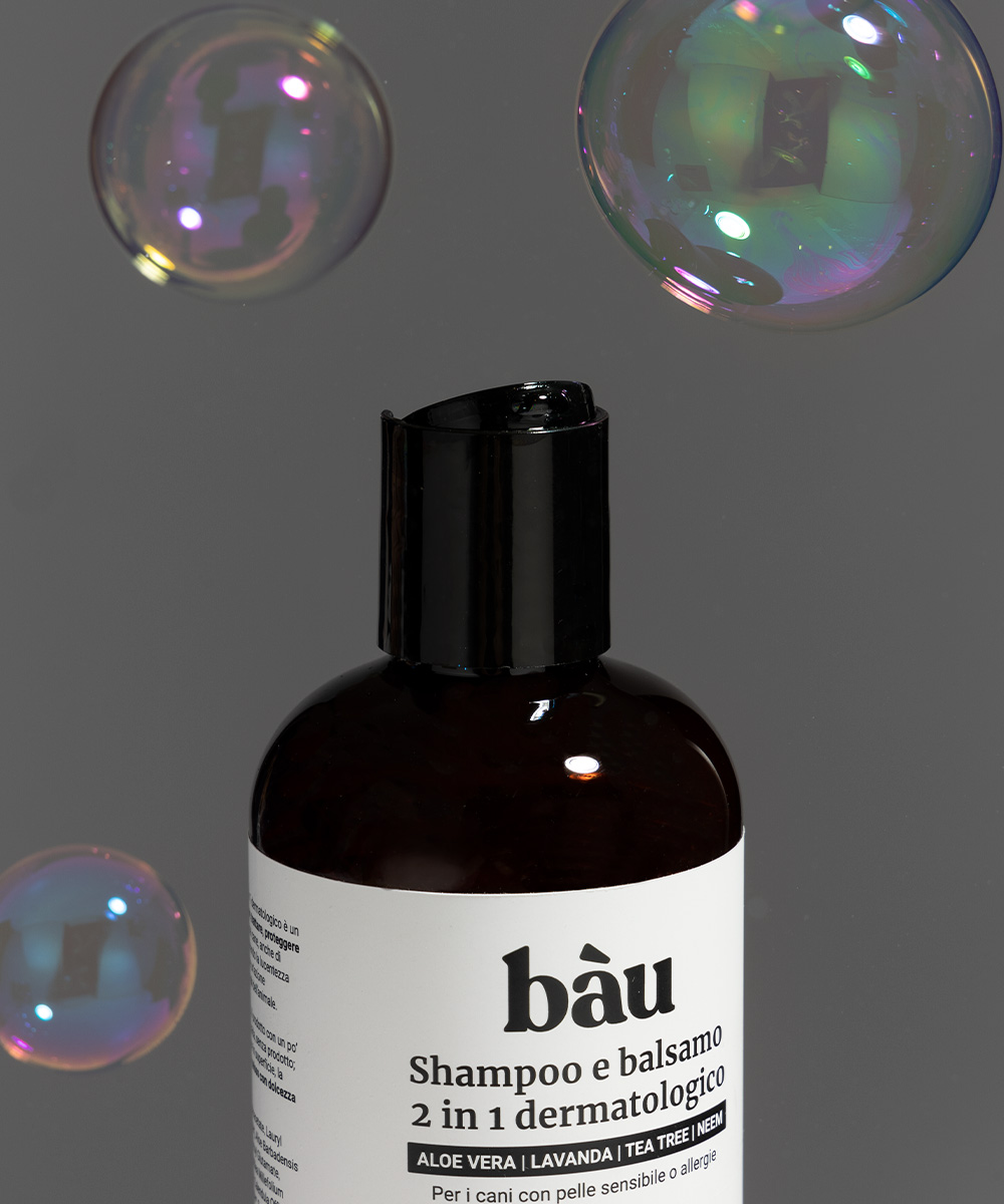
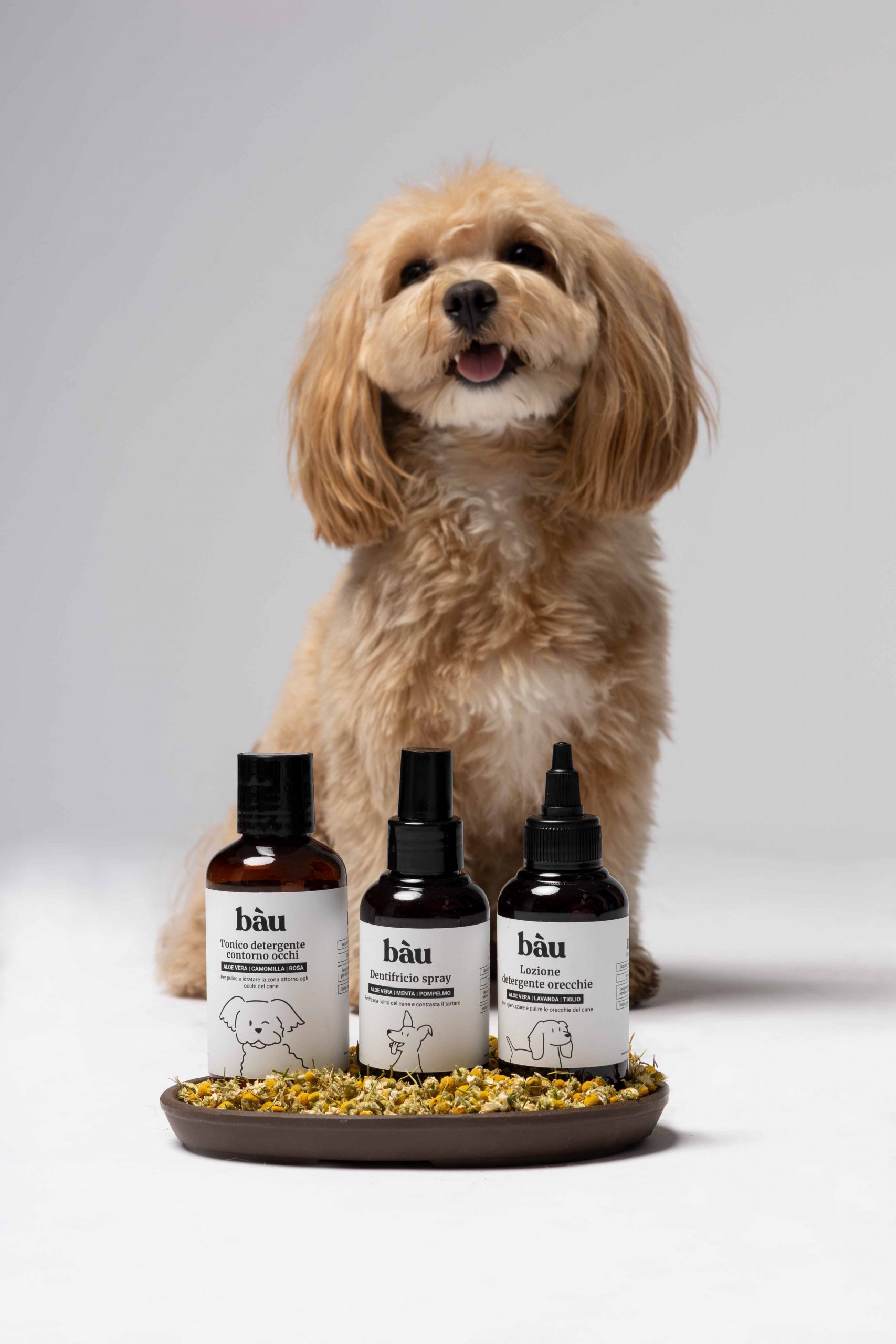
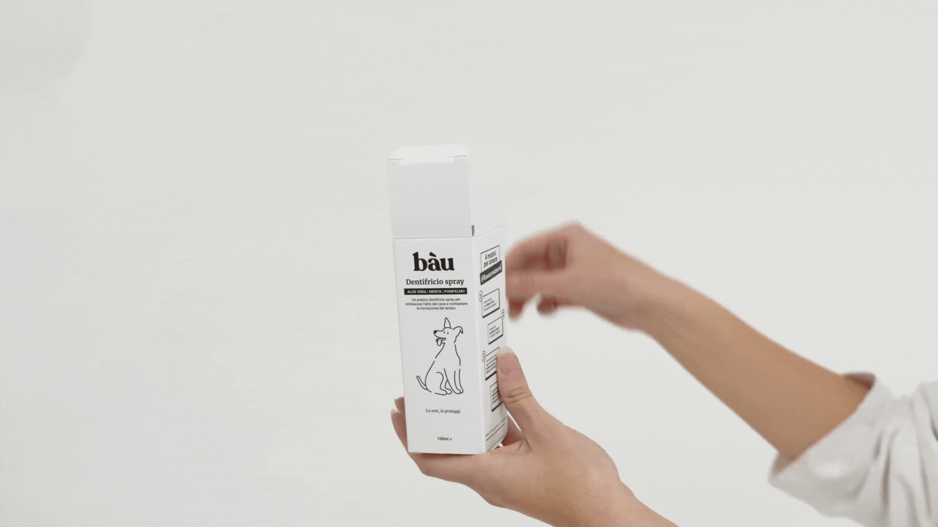
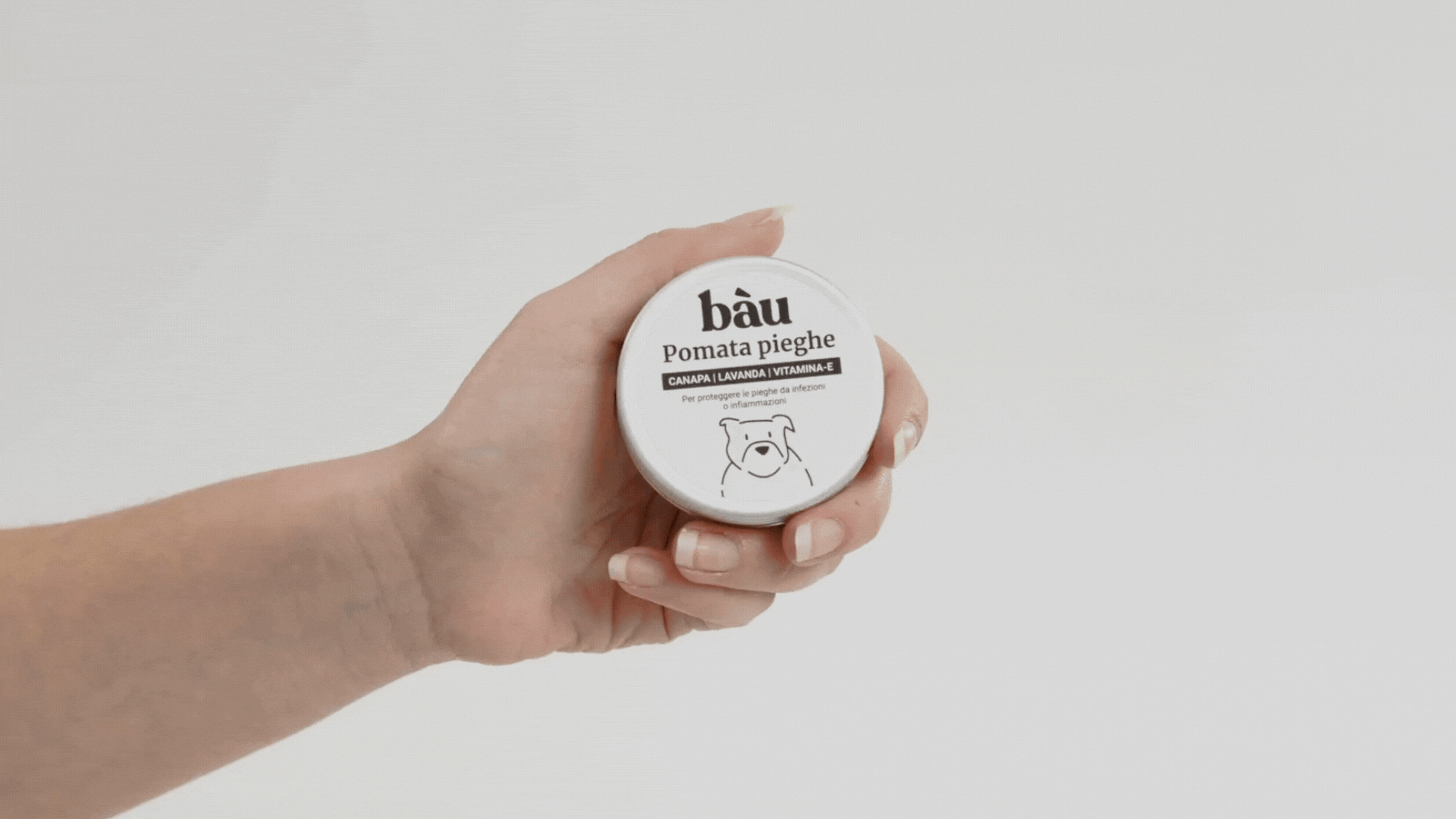
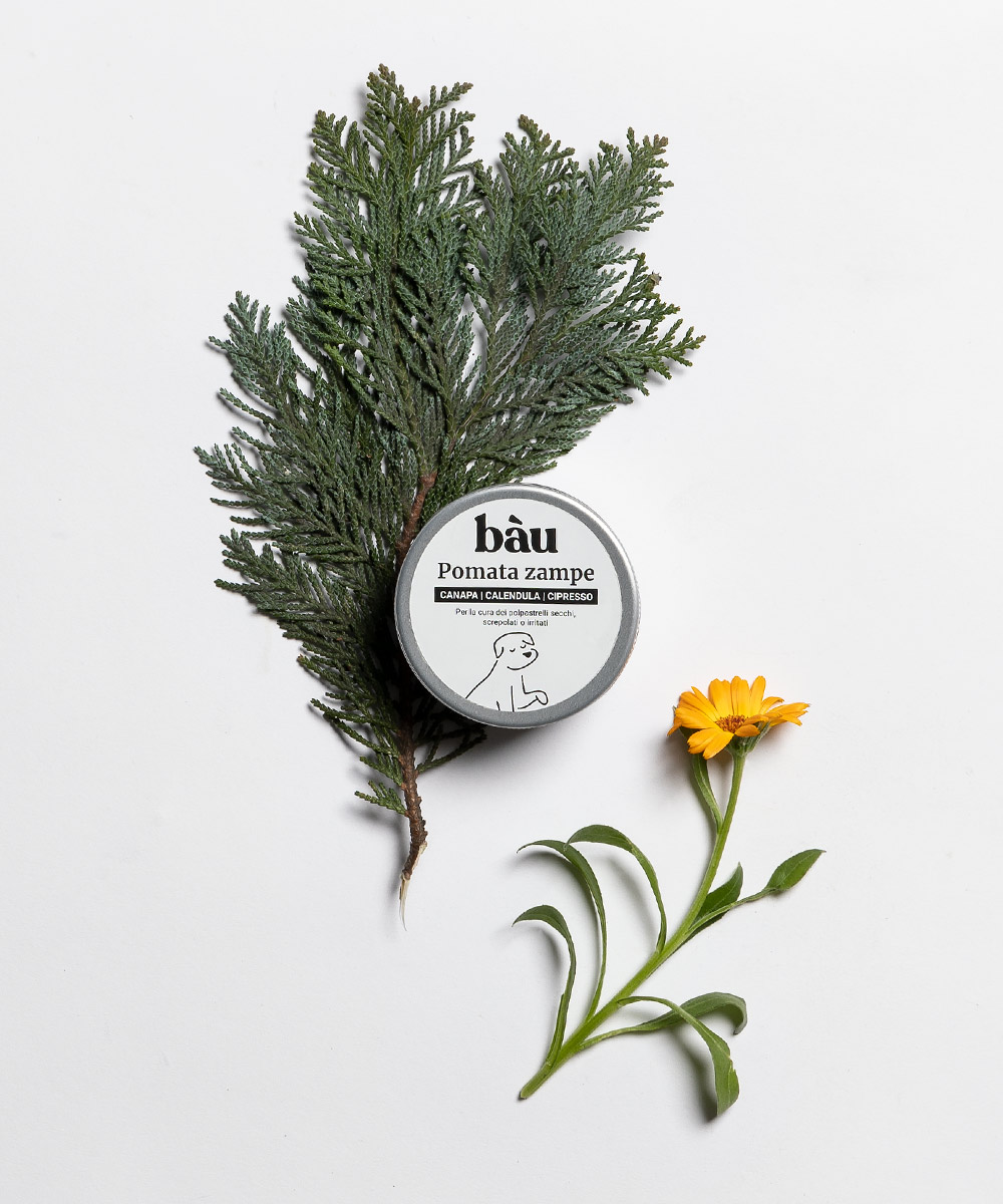
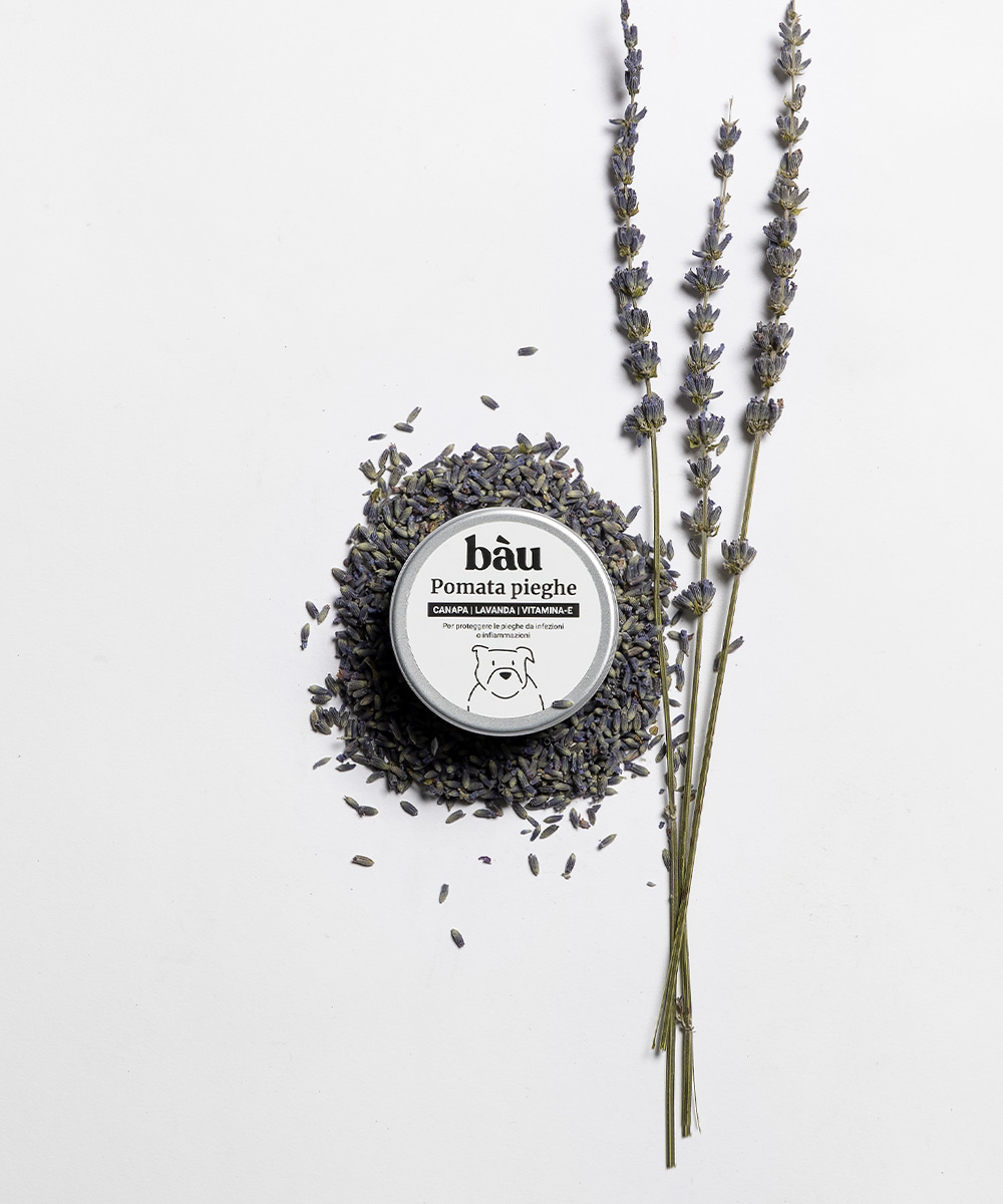
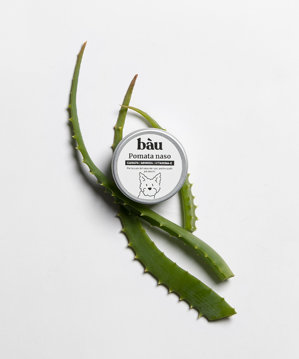
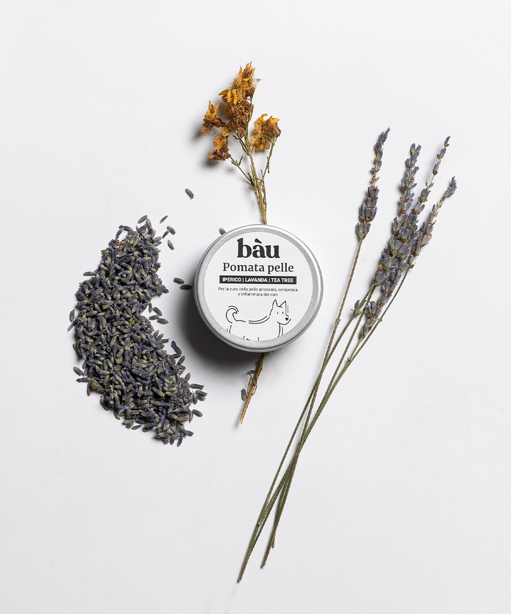
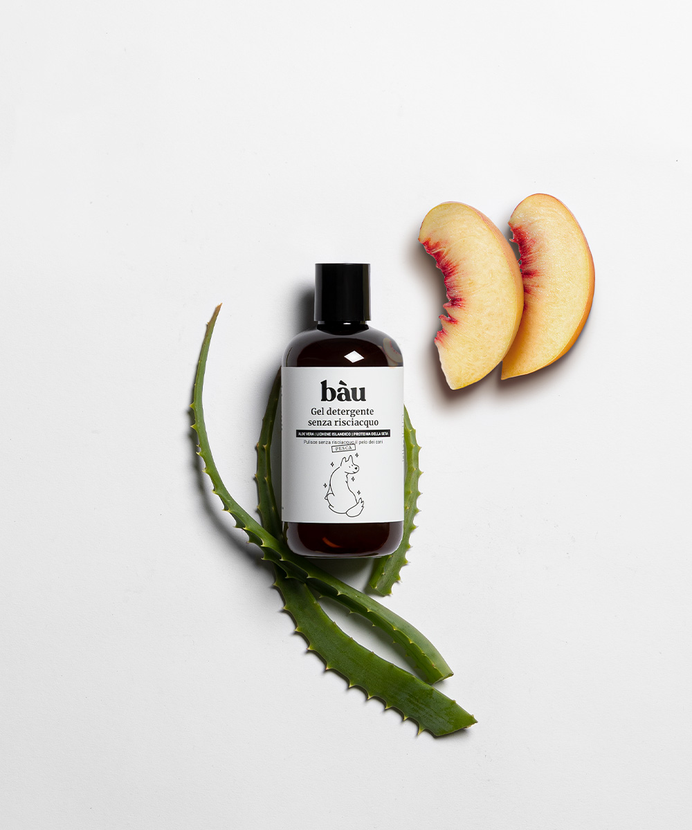
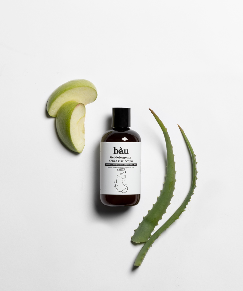
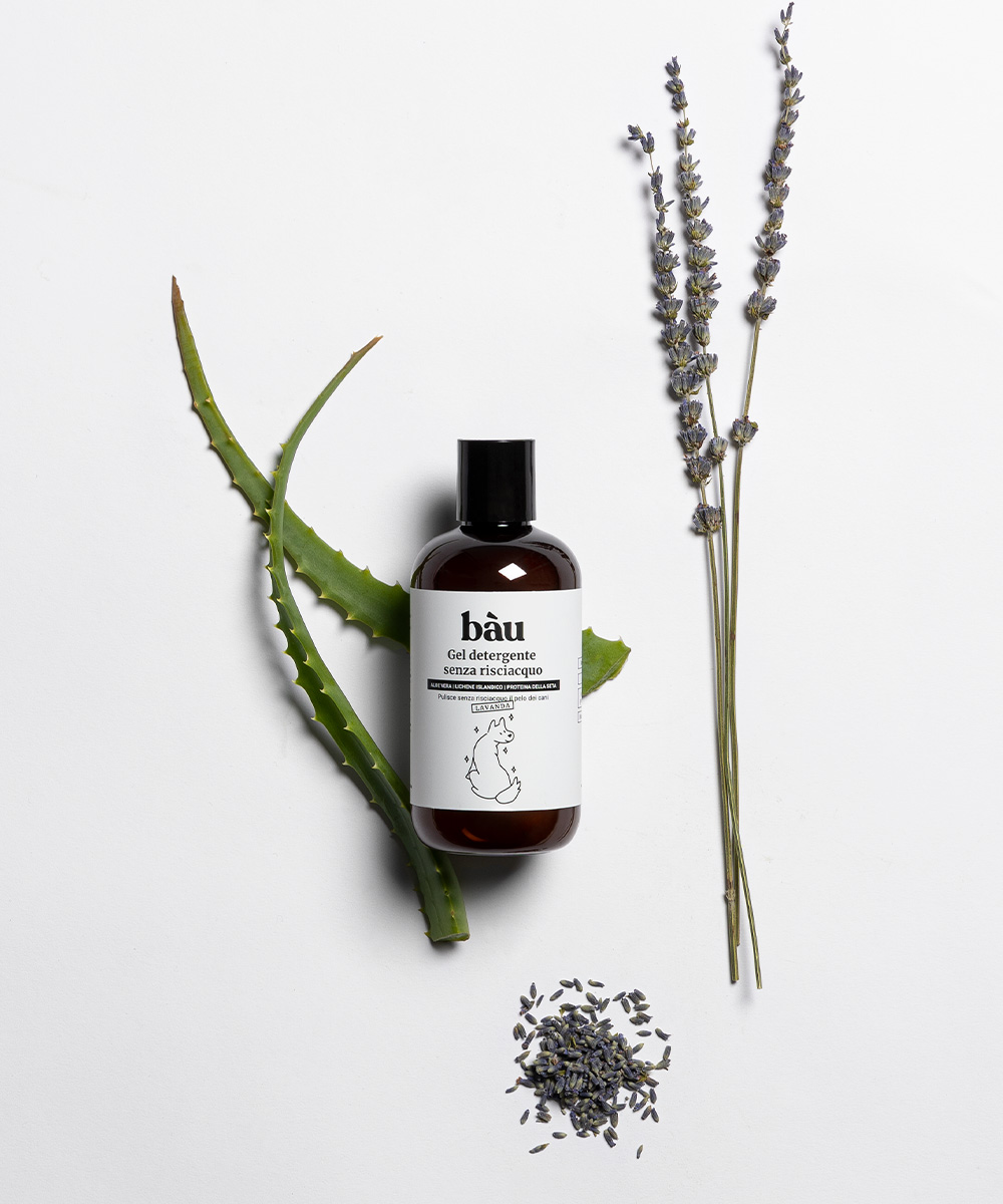
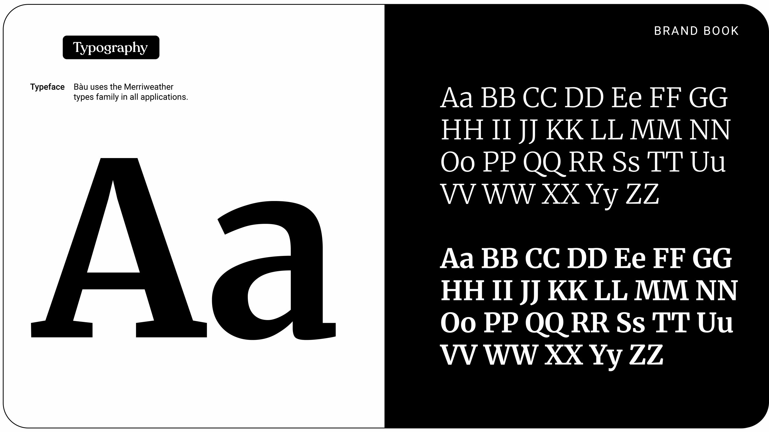
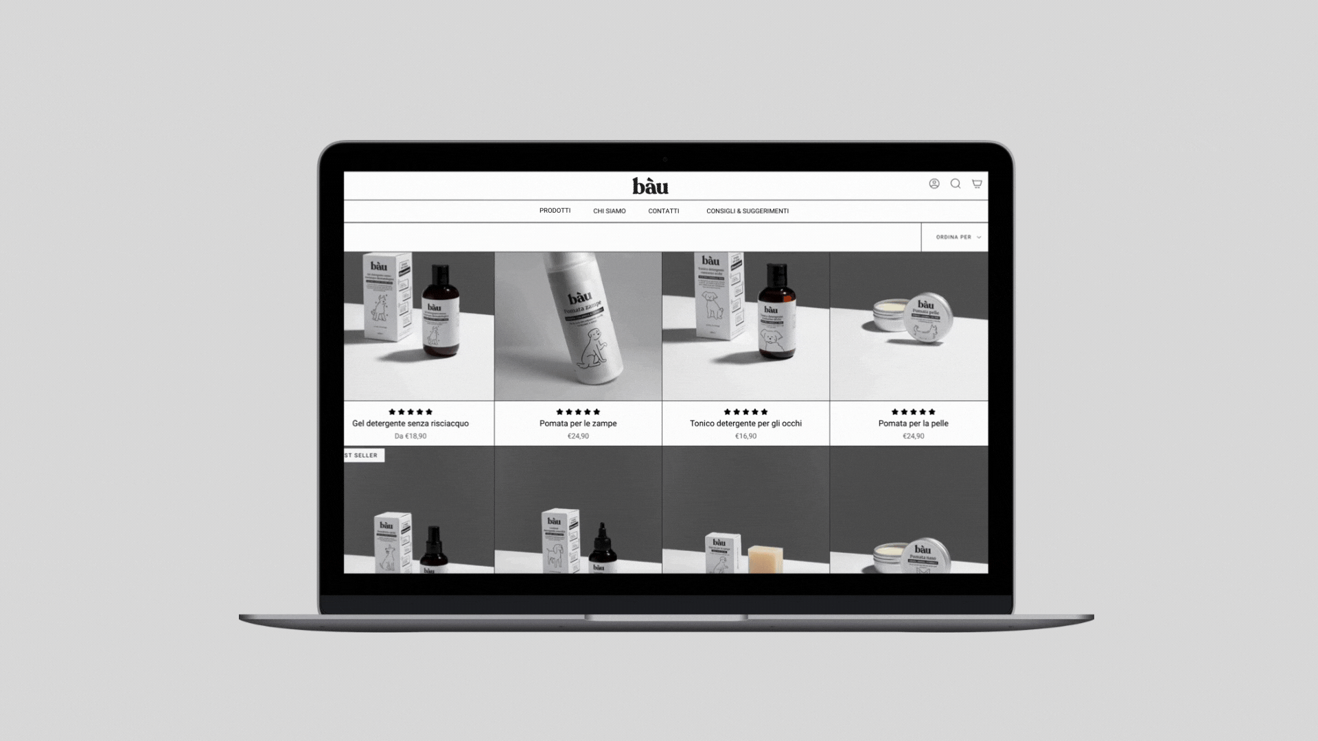
In our visual approach, we opted for a typographic logo, simple illustrations, and a clever absence of color. By achieving harmony through the use of fewer elements, the packaging would make the consumer pause for a second to observe it on a shelf filled with colors and information.
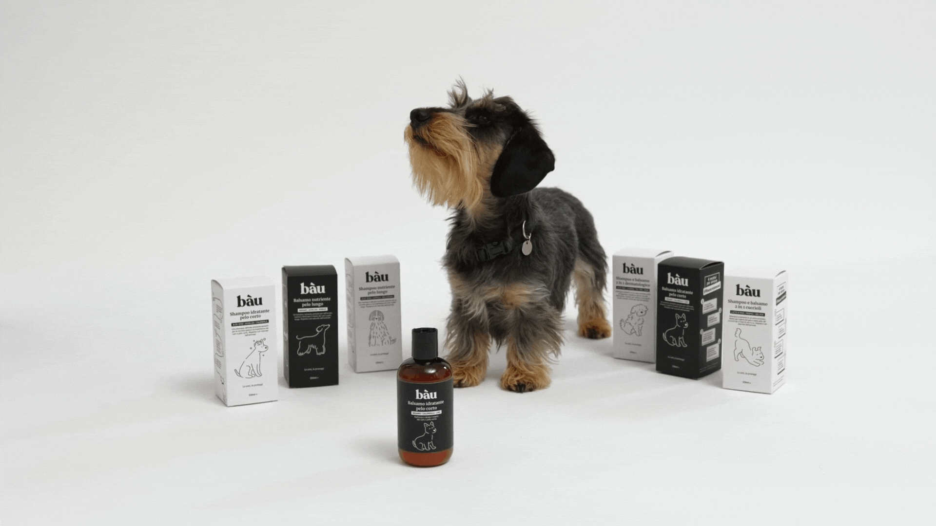
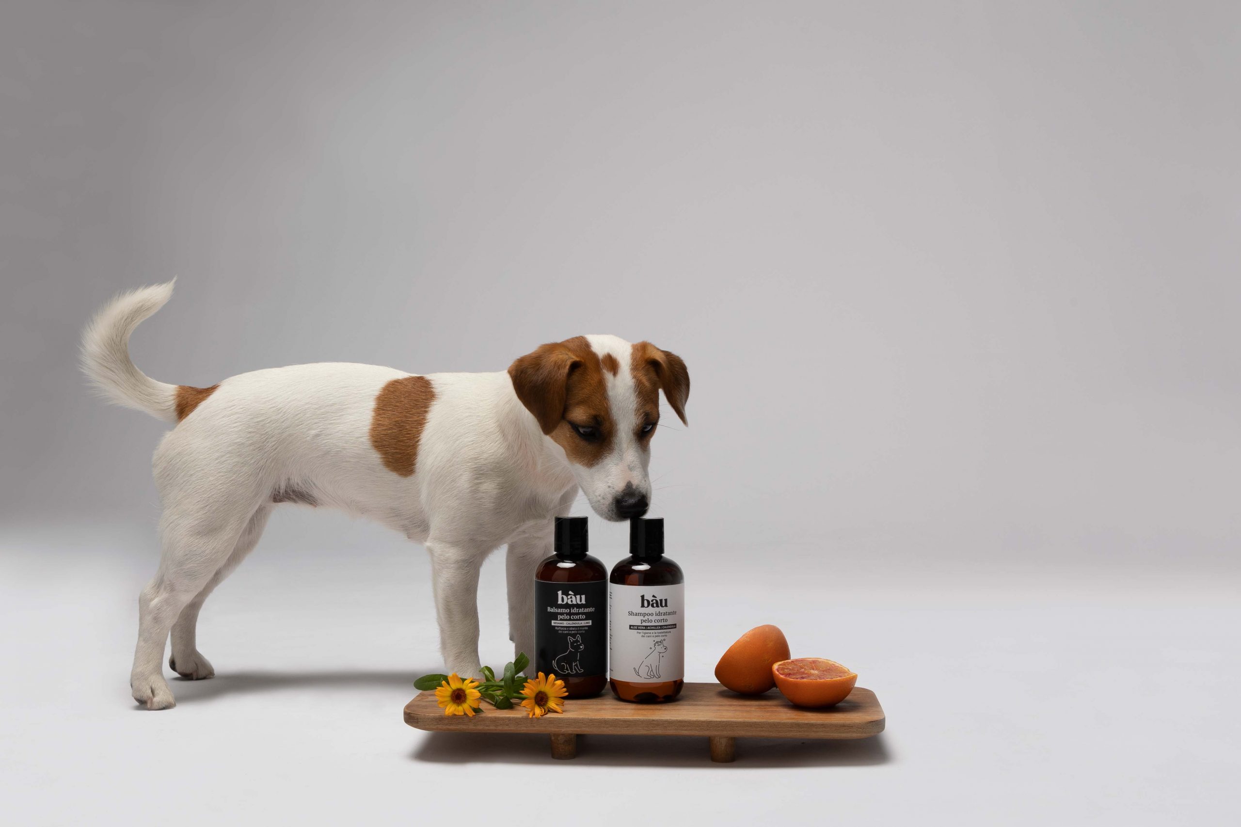
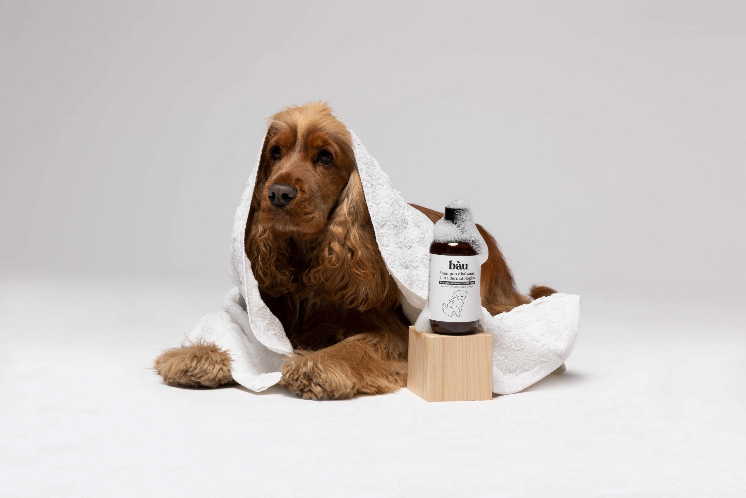
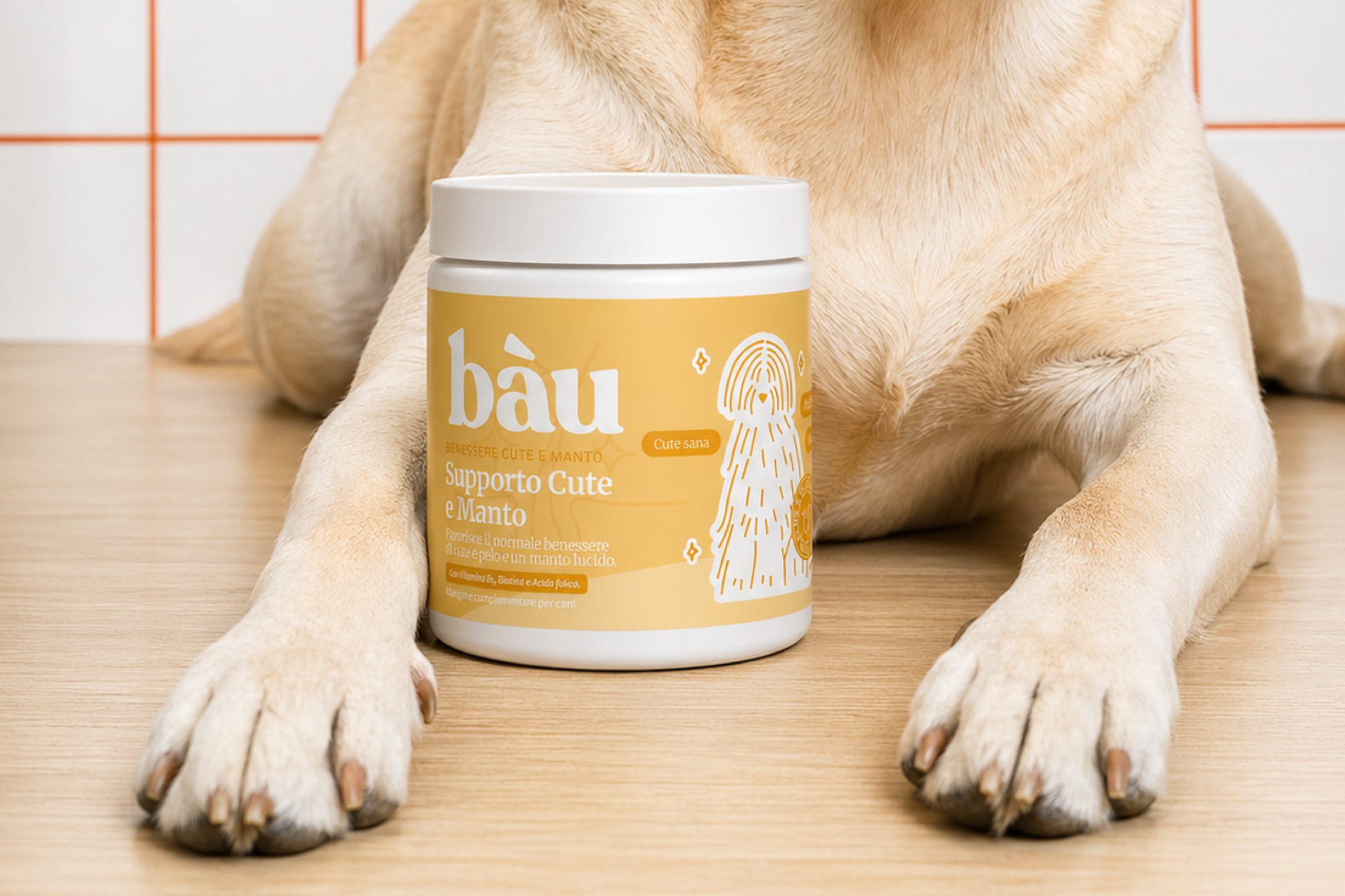
Bau is a brand full of character and personality, showcasing the most fun-loving side of pets, making the brand’s purpose more appealing. The typography and illustrations present a playful and natural vision of caring for dogs. Color is essential in our design as it reinforces the message and personality of the product. The absence of colors helps simplify the product, expressing the brand’s core value: its products are made with 100% natural ingredients without any additional additives.
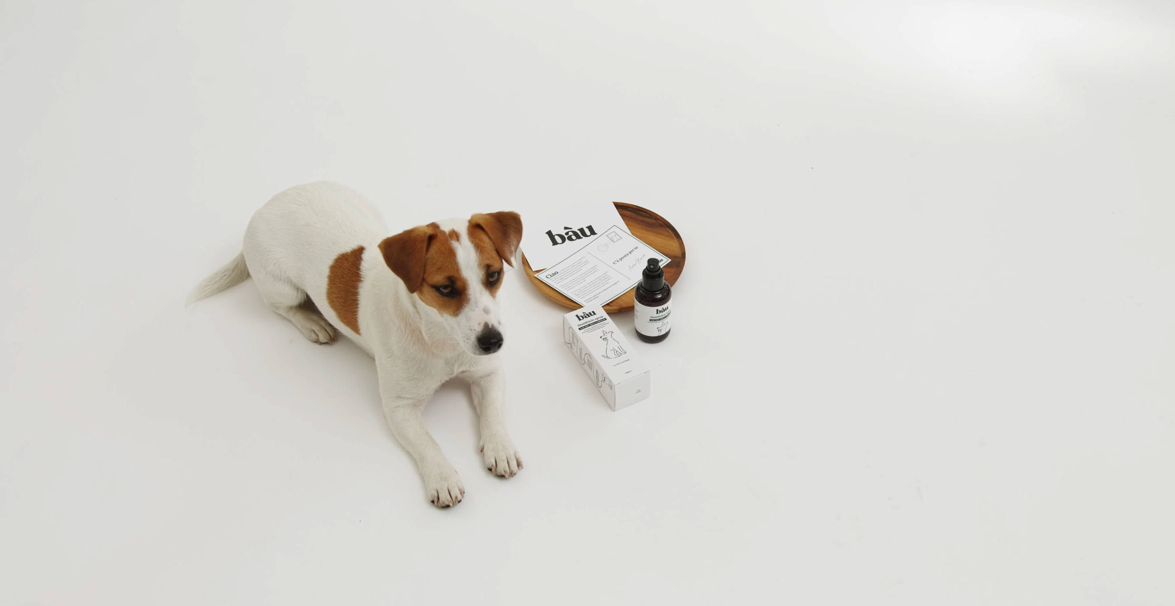
The packaging of each product is personalized with different illustrations of dogs in a playful tone, representing the infinite variety of breeds and their distinct behaviors. These illustrations help create a strong emotional connection with customers and allow them to identify each product and range.